-
Upright
Branding a health-tech startup
-
-
From posture trainer to a wellness tool. The brand needed to distance itself from clinical blue logos while maintaining credibility - landing on a vibrant, health-forward visual language.
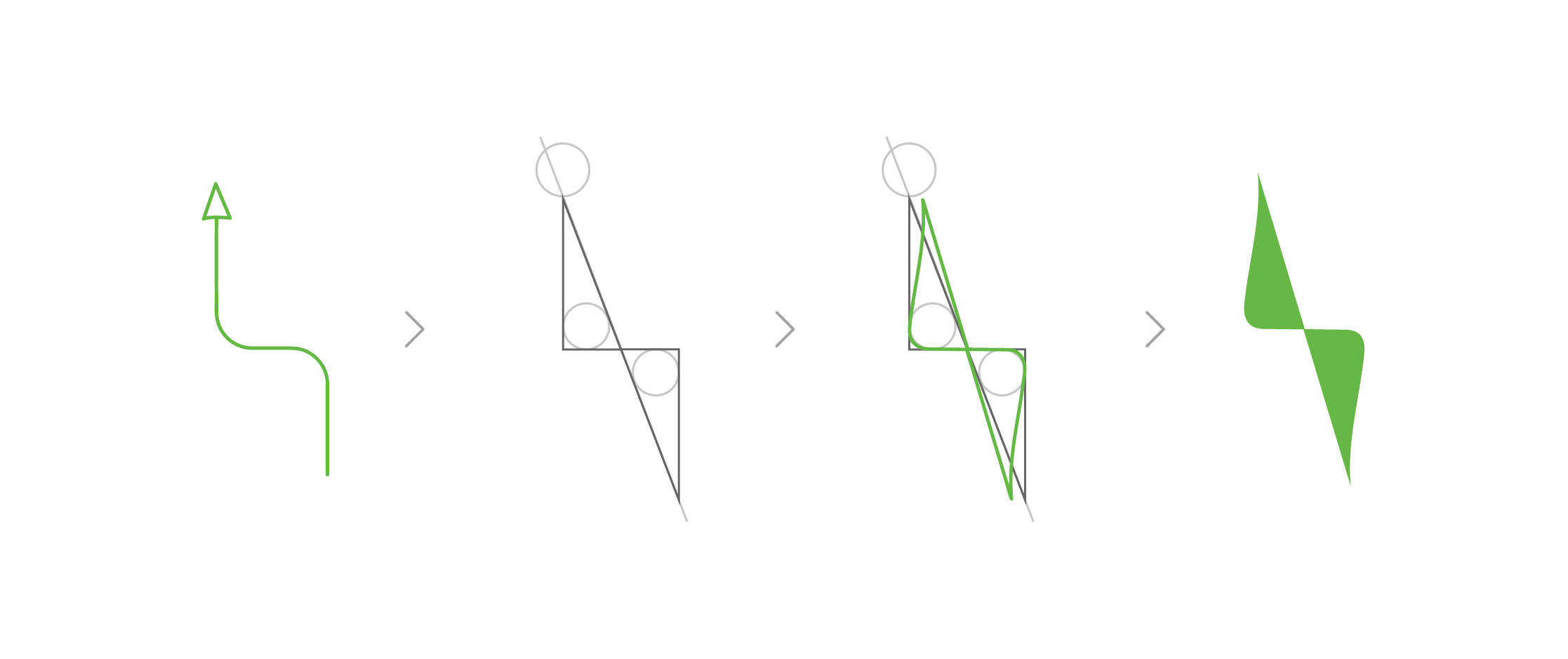
Logo mark exploration inspired by an arrow and a chair—representing a person sitting upright. Curves and softness were added to balance precision with approachability.
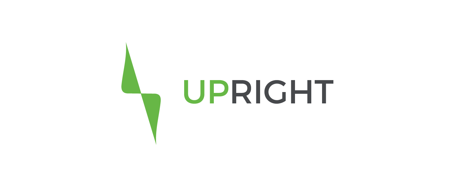
Final wordmark and symbol.
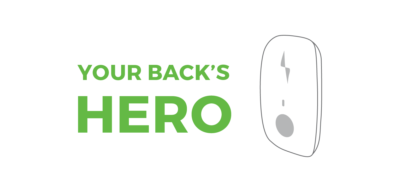
Brand voice: Your back's hero.
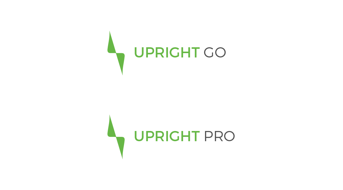
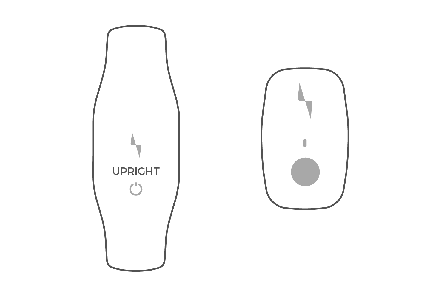
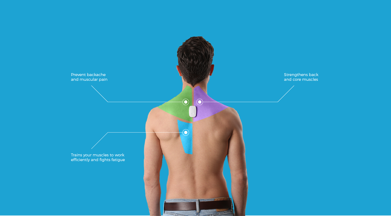
Upright Go and Upright Pro - extending the identity across product tiers.
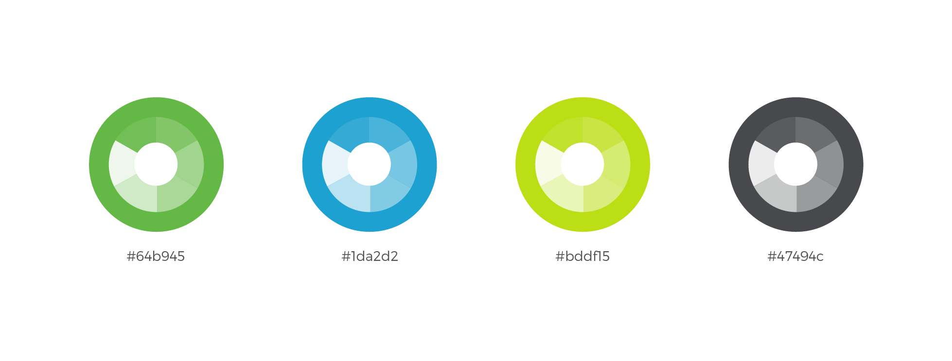
Breaking from medical blue—vibrant greens convey health, vitality, and movement rather than clinical treatment.
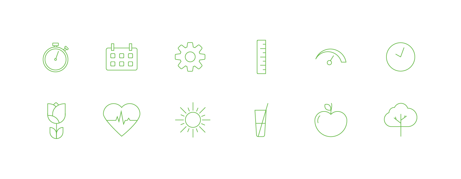
Icon set maintaining the rounded, approachable aesthetic.
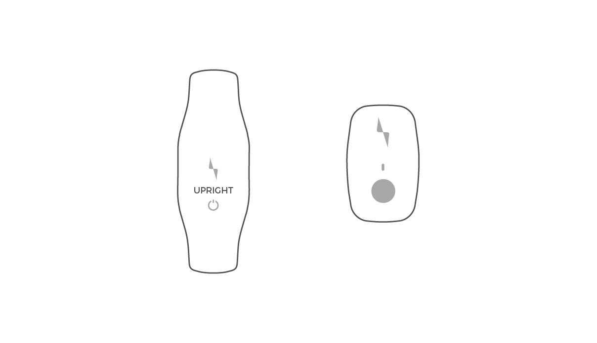
Upright Pro and Upright Go.
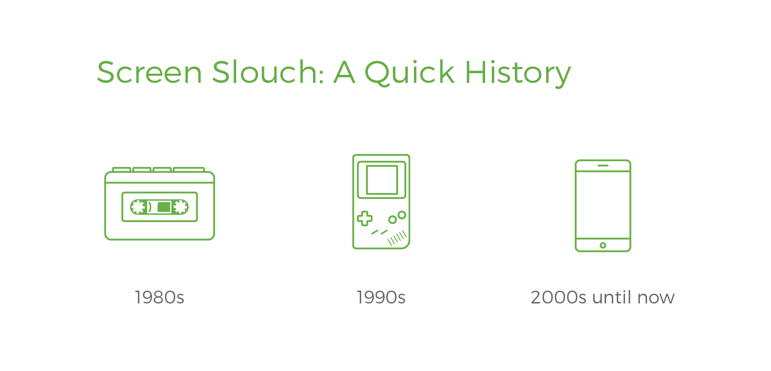
Illustration style for marketing and educational content.
Brand applied to digital experience.
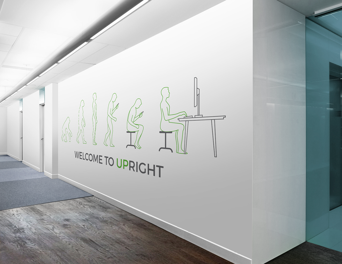
Office wall installation.